# Reading a .csv file
iris = read.csv("iris.csv", header = TRUE, sep = ",")

# Check that the dataset is in the data.frame class
# Data frames are similar to matrices, but the columns can be different data types.

class(iris)
[1] "data.frame"To start, we’ll introduce the first dataset we’re going to work with: the IRIS dataset. Many of its details are documented in the IRIS dataset summary for you to refer to!
From here, we’ll learn how to work with a dataset, by loading it in, and plotting its contents.
When telling R to read a .csv file, you can either provide the entire file path, or just the file name if the .csv is in the same working directory as the R file.
To change the working directory inside Jupyter, you may use the terminal window and cd command. For example, if we want to change to the Documents directory, I would run cd documents in the Jupyter Terminal.
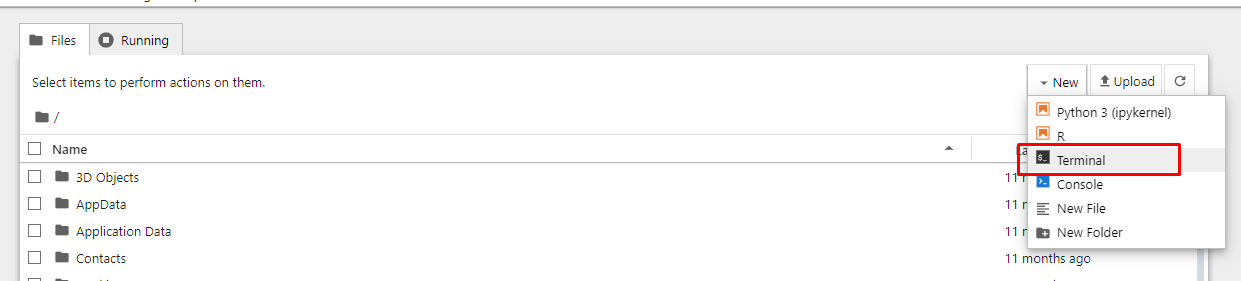
Now that we have set the working directory to our preferences, we can read in the files from there.
# Reading a .csv file
iris = read.csv("iris.csv", header = TRUE, sep = ",")
# Check that the dataset is in the data.frame class
# Data frames are similar to matrices, but the columns can be different data types.
class(iris)[1] "data.frame"Using str(), we can confirm the attributes of the iris data set. The output below indicates that there are 150 observations, which is the equivalent to 150 rows. Additionally, there are 5 variables (columns) shown, named Sepal.Length, Sepal.Width, Petal.Length, Petal.Width, and Species.
We can also note the data type of each column. The first four columns contain the numerical data type, while the Species column contains string data.
str(iris)'data.frame': 150 obs. of 5 variables:
$ Sepal.Length: num 5.1 4.9 4.7 4.6 5 5.4 4.6 5 4.4 4.9 ...
$ Sepal.Width : num 3.5 3 3.2 3.1 3.6 3.9 3.4 3.4 2.9 3.1 ...
$ Petal.Length: num 1.4 1.4 1.3 1.5 1.4 1.7 1.4 1.5 1.4 1.5 ...
$ Petal.Width : num 0.2 0.2 0.2 0.2 0.2 0.4 0.3 0.2 0.2 0.1 ...
$ Species : chr "setosa" "setosa" "setosa" "setosa" ...Viewing the observations can give us a better idea of the data structure. We can quickly check this using head() or tail().
head(iris, 10) # Show the first 10 observations/rows/samples| Sepal.Length | Sepal.Width | Petal.Length | Petal.Width | Species |
|---|---|---|---|---|
| 5.1 | 3.5 | 1.4 | 0.2 | setosa |
| 4.9 | 3.0 | 1.4 | 0.2 | setosa |
| 4.7 | 3.2 | 1.3 | 0.2 | setosa |
| 4.6 | 3.1 | 1.5 | 0.2 | setosa |
| 5.0 | 3.6 | 1.4 | 0.2 | setosa |
| 5.4 | 3.9 | 1.7 | 0.4 | setosa |
| 4.6 | 3.4 | 1.4 | 0.3 | setosa |
| 5.0 | 3.4 | 1.5 | 0.2 | setosa |
| 4.4 | 2.9 | 1.4 | 0.2 | setosa |
| 4.9 | 3.1 | 1.5 | 0.1 | setosa |
tail(iris, 3) # Show the last 3 observations/rows/samples| Sepal.Length | Sepal.Width | Petal.Length | Petal.Width | Species | |
|---|---|---|---|---|---|
| 148 | 6.5 | 3.0 | 5.2 | 2.0 | virginica |
| 149 | 6.2 | 3.4 | 5.4 | 2.3 | virginica |
| 150 | 5.9 | 3.0 | 5.1 | 1.8 | virginica |
Factors are variables with a fixed set of values. In the iris data set, the Species column is a categorical variable that has a fixed set of values (the different iris species), and as such, we can factorize it.
Afterwards, the Species column is no longer defined as a character-type column, but rather, a factor with three levels, defining the three distinct species of iris.
# Converts the Species column to a factor
iris$Species = as.factor(iris$Species)
str(iris) # Check what the Species column is now defined as
'data.frame': 150 obs. of 5 variables:
$ Sepal.Length: num 5.1 4.9 4.7 4.6 5 5.4 4.6 5 4.4 4.9 ...
$ Sepal.Width : num 3.5 3 3.2 3.1 3.6 3.9 3.4 3.4 2.9 3.1 ...
$ Petal.Length: num 1.4 1.4 1.3 1.5 1.4 1.7 1.4 1.5 1.4 1.5 ...
$ Petal.Width : num 0.2 0.2 0.2 0.2 0.2 0.4 0.3 0.2 0.2 0.1 ...
$ Species : Factor w/ 3 levels "setosa","versicolor",..: 1 1 1 1 1 1 1 1 1 1 ...Question: Can you tell from the output above, which variable(s) are quantitive and which variable(s) are categorical?
The $ sign following a data frame variable, and its column name will return a vector with the data in that column.
Since it returns a vector, we can retrieve specific values of the vector through calling it’s index. See vectors for examples.
# As demonstrated, we can retrieve the names of the volumns as a character vector
# by using colnames()

colnames(iris)
[1] "Sepal.Length" "Sepal.Width" "Petal.Length" "Petal.Width" "Species" # Display only the first 10 observations of Sepal.Width
iris$Sepal.Width[1:10] [1] 3.5 3.0 3.2 3.1 3.6 3.9 3.4 3.4 2.9 3.1# If we want to display all observations of Sepal.Width, we can
# remove the brackets, and only type:
# iris$Sepal.WidthThere are alternative methods to retrieving data from a specific column and row without using the $ sign. We can use [row, column] on a data frame where df[2,1] (with df being the name of the data frame) would return the value on the second row, first column.
# ====== View the dataframe as a matrix =======
# Note that the Sepal.Width is the 2nd column
# display all observations of Sepal.Width

iris[,2]
[1] 3.5 3.0 3.2 3.1 3.6 3.9 3.4 3.4 2.9 3.1 3.7 3.4 3.0 3.0 4.0 4.4 3.9 3.5
[19] 3.8 3.8 3.4 3.7 3.6 3.3 3.4 3.0 3.4 3.5 3.4 3.2 3.1 3.4 4.1 4.2 3.1 3.2
[37] 3.5 3.1 3.0 3.4 3.5 2.3 3.2 3.5 3.8 3.0 3.8 3.2 3.7 3.3 3.2 3.2 3.1 2.3
[55] 2.8 2.8 3.3 2.4 2.9 2.7 2.0 3.0 2.2 2.9 2.9 3.1 3.0 2.7 2.2 2.5 3.2 2.8
[73] 2.5 2.8 2.9 3.0 2.8 3.0 2.9 2.6 2.4 2.4 2.7 2.7 3.0 3.4 3.1 2.3 3.0 2.5
[91] 2.6 3.0 2.6 2.3 2.7 3.0 2.9 2.9 2.5 2.8 3.3 2.7 3.0 2.9 3.0 3.0 2.5 2.9
[109] 2.5 3.6 3.2 2.7 3.0 2.5 2.8 3.2 3.0 3.8 2.6 2.2 3.2 2.8 2.8 2.7 3.3 3.2
[127] 2.8 3.0 2.8 3.0 2.8 3.8 2.8 2.8 2.6 3.0 3.4 3.1 3.0 3.1 3.1 3.1 2.7 3.2
[145] 3.3 3.0 2.5 3.0 3.4 3.0# display the first 10 observations of Sepal.Width
iris[1:10,2] [1] 3.5 3.0 3.2 3.1 3.6 3.9 3.4 3.4 2.9 3.1The summary() function returns summary statistics for any data set, and all of its variable columns.
summary(iris) Sepal.Length Sepal.Width Petal.Length Petal.Width
Min. :4.300 Min. :2.000 Min. :1.000 Min. :0.100
1st Qu.:5.100 1st Qu.:2.800 1st Qu.:1.600 1st Qu.:0.300
Median :5.800 Median :3.000 Median :4.350 Median :1.300
Mean :5.843 Mean :3.054 Mean :3.759 Mean :1.199
3rd Qu.:6.400 3rd Qu.:3.300 3rd Qu.:5.100 3rd Qu.:1.800
Max. :7.900 Max. :4.400 Max. :6.900 Max. :2.500
Species
setosa :50
versicolor:50
virginica :50
It can also be called on one variable instead of on the whole dataset.
Try running
summary(iris$Sepal.Length)and compare the output with the above summary.
Similar to str(), the output from summary() shows that there are 150 observations (rows) and 5 variables (columns). Here, four of the variables are numberic (Sepal.Length, Sepal.Width, Petal.Length, Petal.Width), while the fifth variable, Species is a factor.
The Species factor has three levels, however, in many outputs we cannot tell that right away.
Instead, using the levels() function will give us a precise number of levels in a factor, as well as the value/name of each one.
levels(iris$Species)[1] "setosa" "versicolor" "virginica" The input above shows that there are three levels in total for Species, named setosa, versicolor, and virginica.
So, there are three levels, but how is the data distributed among the species? How many observations are recorded for setosa, versicolor, and virginica each? We can answer this question with the table() function.
table(iris$Species)| Species | Freq |
|---|---|
| setosa | 50 |
| versicolor | 50 |
| virginica | 50 |
As seen above, the observations for each species is distributed equally, with 50 observations each.
There are several ways to visualize data depending on the data type and context. R comes with built-in functions to visualize, including, but not limited to:
Note: Pie charts are only applicable on categorical data
In order to effectively use pie charts, the chart must have these characteristics:
Pie charts should only be used when we want to emphasize each category’s relationship to the whole.
To create a simple pie chart, we can use the built-in R function pie(). We will use the iris$Species count data generated in factor levels since Species is a categorical variable (all factors are categorical).
pie(table(iris$Species),
    col=c("lightblue", "lightgray", "lightgreen"), # Color vector
    main = "Pie chart of Species") # Title
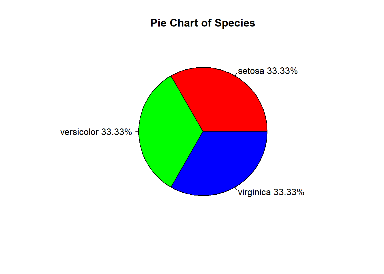
lbls = paste(c("setosa","versicolor","virginica"),c("33.33","33.33","33.33"))
lbls = paste(lbls,"%",sep="")
# Pie charts with percentage
pie(table(iris$Species),
    labels = lbls,
    col=rainbow(length(lbls)),
    main="Pie Chart of Species")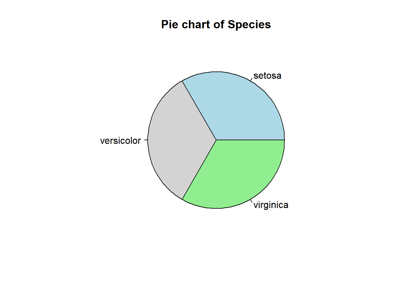
A bar plot will:
For example, if we were to compare the mean petal length of each iris species, we would have to aggregate the data. The aggregation involves grouping the data up (in our case, the groups are the different species), and performing an operation on each group (in our case, the operation would be mean()).
iris.mean <- aggregate(x = iris$Petal.Length,   # Specify data set or column
                       by = list(iris$Species), # Specify group indicator
                       FUN = mean)              # Specify function

iris.mean| Group.1 | x |
|---|---|
| setosa | 1.464 |
| versicolor | 4.260 |
| virginica | 5.552 |
Once we have a mean for each group, we can apply it to a bar graph using the barplot() function. The parameters in barplot() are formatted as follows:
barplot(y-axis ~ x-axis-groups) for the main data.
main: the name of the bar plotylab and xlab: the labels of the y and x axes, respectivelycex.lab: expansion factor for bar labelsbarplot(iris.mean$x ~ iris.mean$Group.1,
main = "Study Field Distribution",
ylab = "Petal Length (cm)",
xlab = "Species",
cex.lab = 1.2)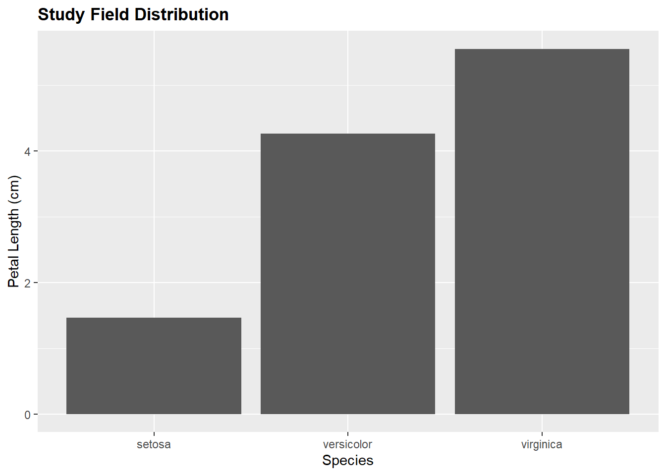
The above code produced a basic bar graph with the information on the average petal length of each species.
However, we can go into further detail: what if we want to split the counts further by breaking the Petal length into categories of length?
For example, the categories could be: 4.3 (min), 4.4, 4.5, … , 7.9 (max), in cm. Afterwards, we then count the total number of observations in each species.
# First, we need to break the range of Petal length into categories
# with the number of observations in each species

table(iris$Species, iris$Petal.Length)

# Using this table with the petal length categories, and species observations
# We can call barplot() again

barplot(table(iris$Species, iris$Petal.Length),
              # Col specifies the color for each species
              col = rainbow(3),
              # Adds a legend for each color-species match
              legend.text = c("setosa", "versicolor", "virginica"),
              # Axis labels
              ylab = "counts",
              xlab = "Petal Length (cm)",
              cex.lab = 1.2)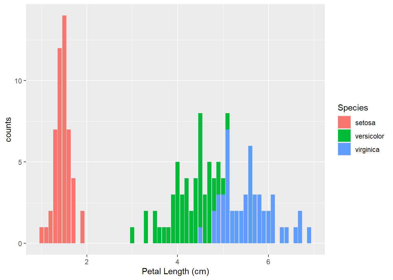
We can repurpose this code to create a similar bar graph with petal width instead of length:
barplot(table(iris$Species, iris$Petal.Width),
              col = rainbow(3),
              legend.text = c("setosa", "versicolor", "virginica"),
              ylab = "counts",
              xlab = "Petal Width (cm)",
              cex.lab = 1.2)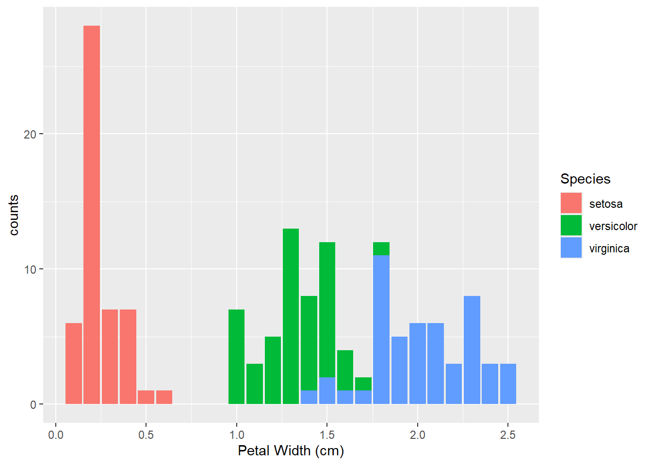
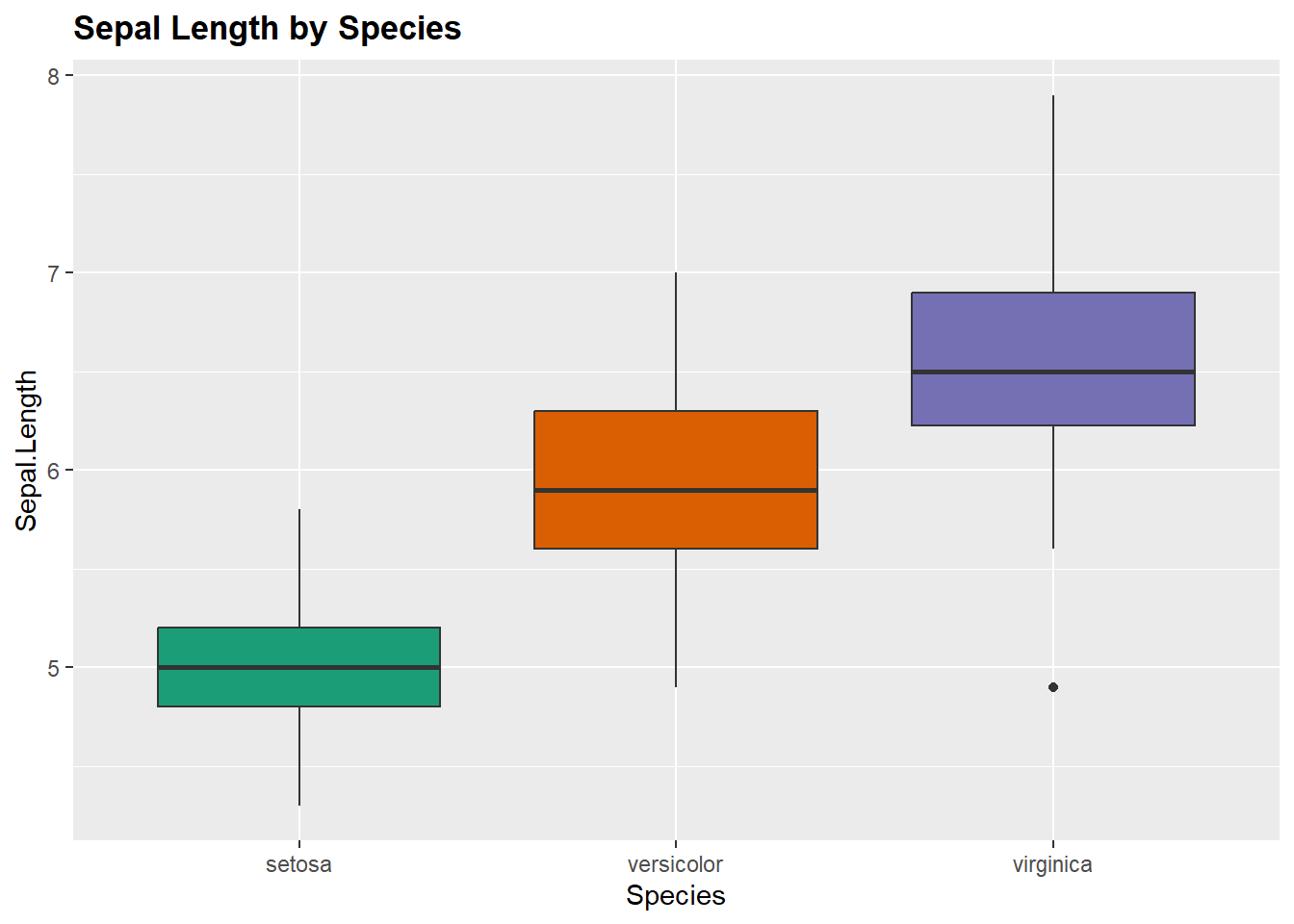
A box plot shows the five-number summary from a set of data:
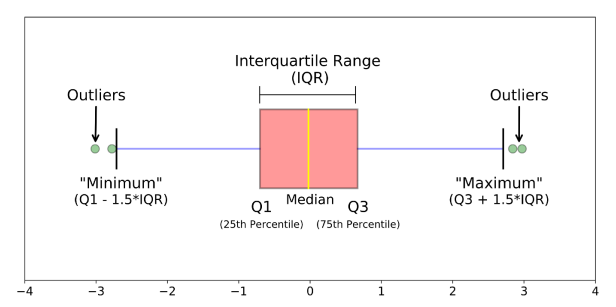
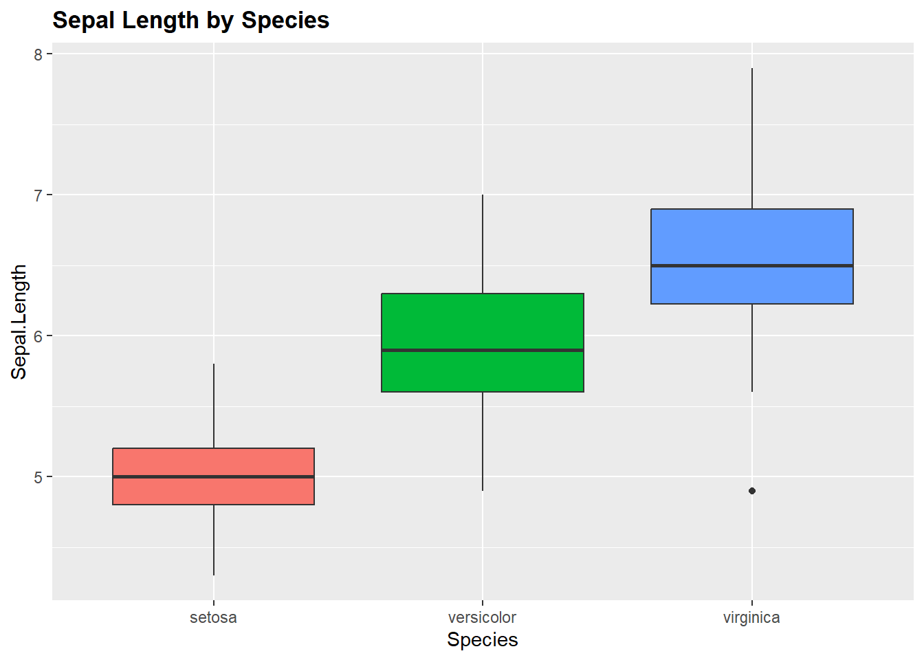
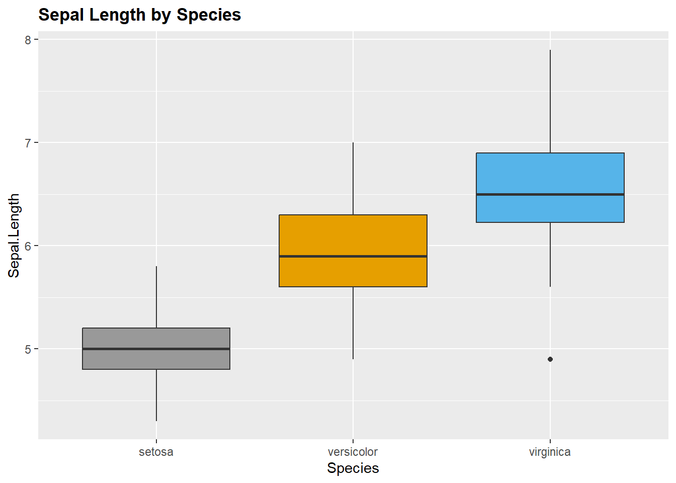
R provides a boxplot() function, where we can input categorical data as: boxplot(y_axis_data ~ x_axis_categories).
boxplot(iris$Sepal.Length ~ iris$Species,
        col = topo.colors(3),
        main = "Sepal Length by Species")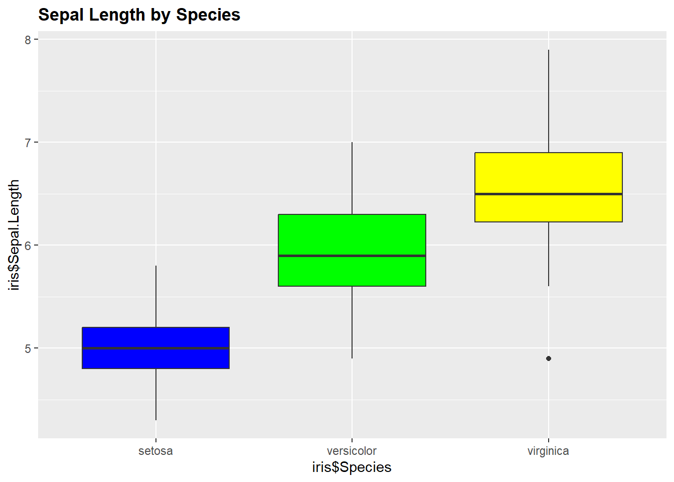
Histograms for quantative variables show the distribution of a quantitative variable by using bars where the height of each bar represents the number of individuals who take on a value within a particular class.
# A simple histogram of the Sepal Length
hist(iris$Sepal.Length,
     nclass = 20)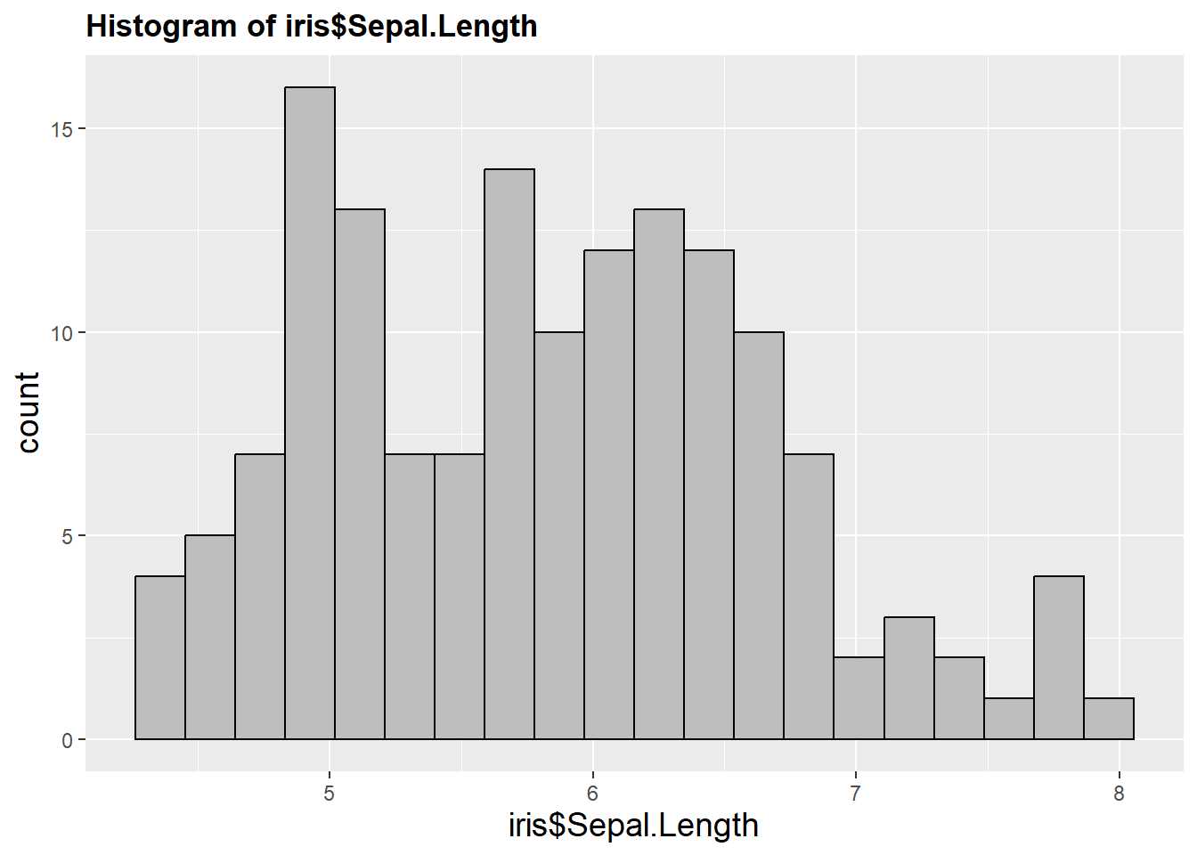
The above graph is clean, simple, and easy, but we can improve this more. We can firstly improve the histogram by using the “breaks” option.
Note that nclass functions similarly to breaks but is only applicable on numeric data.
hist(iris$Sepal.Length, breaks = 30)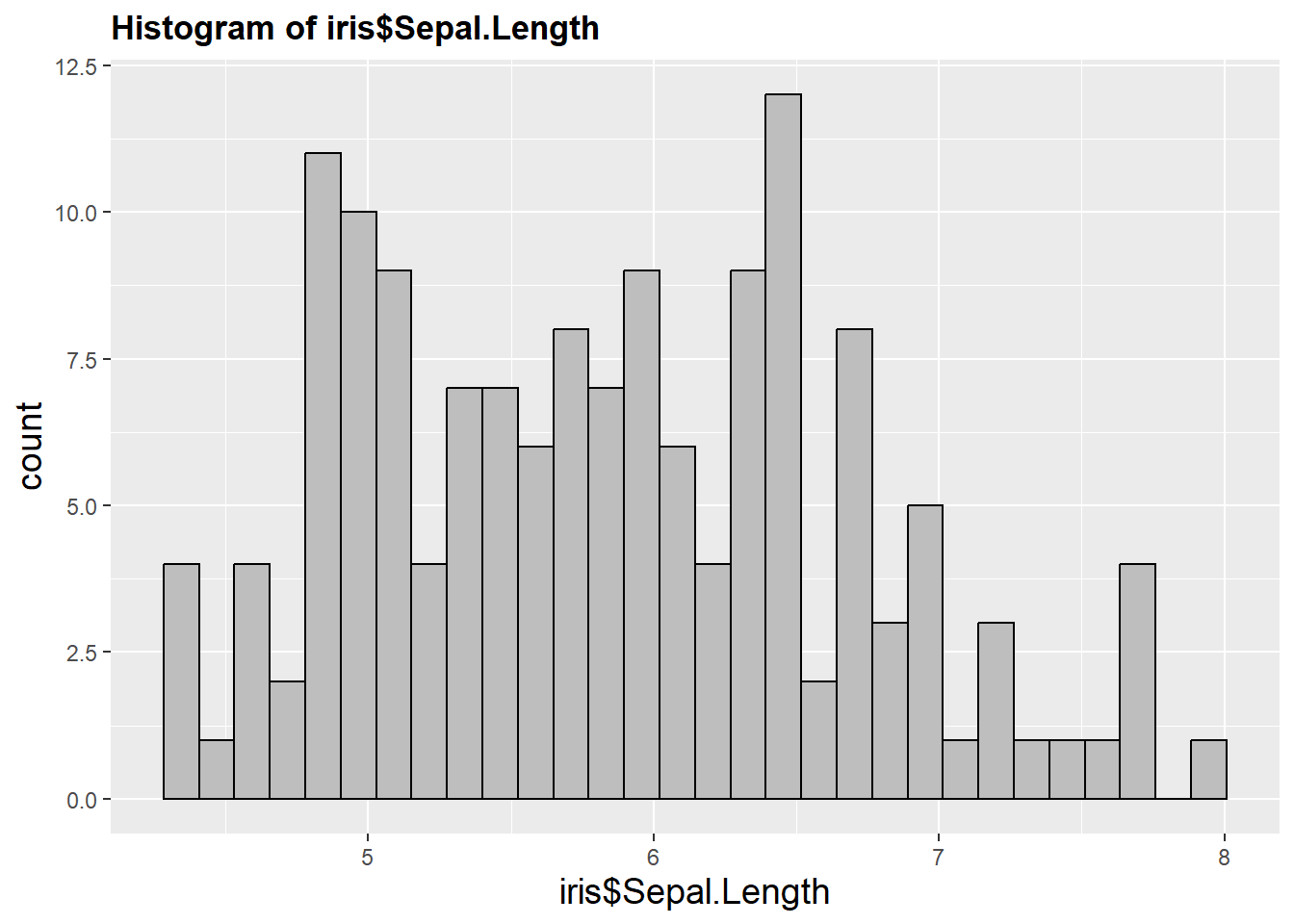
The next improvement we can make is by converting the y-axis from count to probability density.
y.val = counts/(n*diff(breaks))
hist(iris$Sepal.Length, breaks = 30, probability = TRUE, ylim = c(0,1))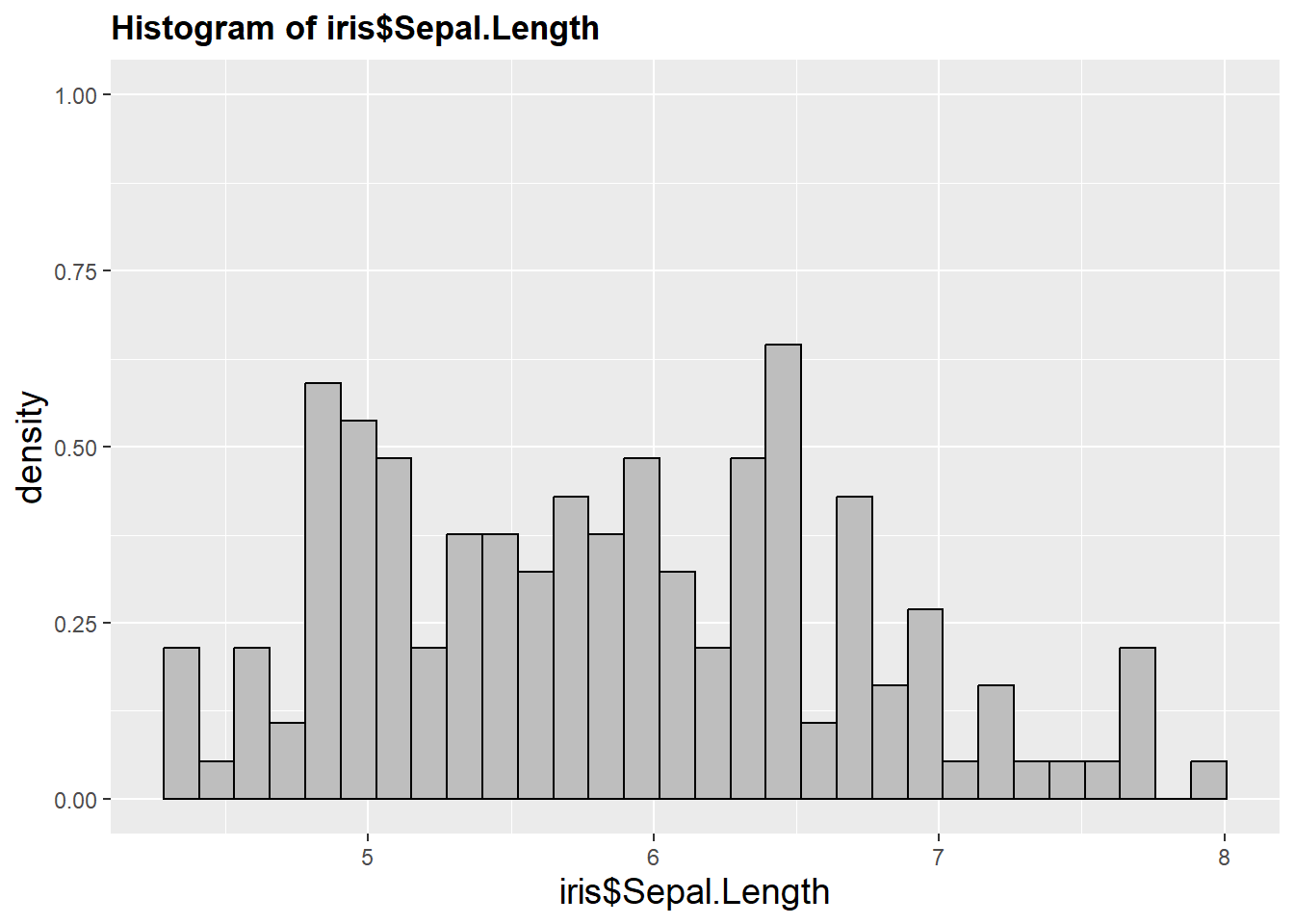
The hist() function is highly customizable. The parameters allow us to edit the axes, the labels, the breaks, and the formatting in detail.
# Adding more in the histogram:
hist(iris$Sepal.Length,  # Specify the target variable
     breaks = 30,        # Specify the number of cells for the histogram
     prob = T,           # Specify y axis is the probability density value
     xlim = c(4, 8),     # X range
     ylim = c(0.0, 1.0), # Y range
     col = "lightblue",  # Fill color for the bar
     xlab = "Sepal Length (cm)",
     main = "IRIS - Sepal length (cm)",
     cex.lab=1.2)        # Set the x,y labels to 120%
lines(density(iris$Sepal.Length), col = "blue", lwd = 2)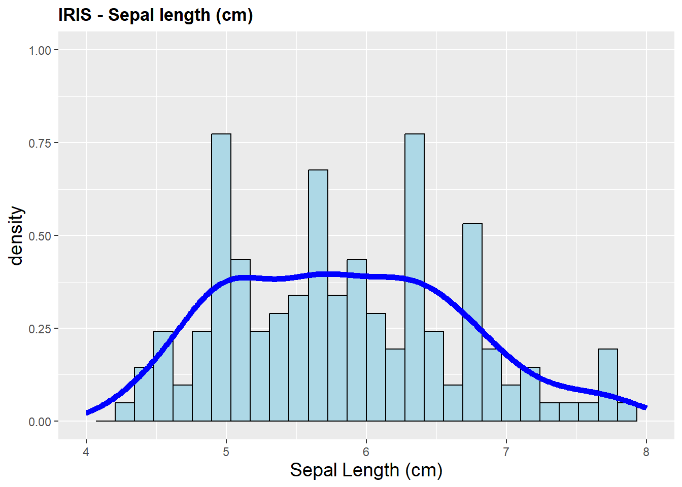
Scatter plots are dispersion graphs built to represent the data points of two variables. The visual aid a scatter plot provides allows us to visually check if there is a relationship between numeric variables.
Below is a simple scatter plot between Petal.Length and Petal.Width where the two inputs of plot() is are the variable columns:
plot(iris$Petal.Length, iris$Petal.Width)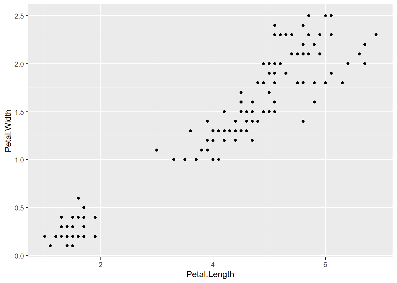
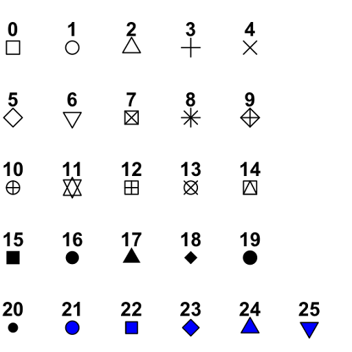
There are additional arguments in the plot() function, such as pch, which will allow us to determine the shape of each plotted data point. The default often is pch=1.
plot(iris$Petal.Length, iris$Petal.Width,
     pch=21,
     # Map three species to different colors
     bg=c("red","green3","blue")[unclass(iris$Species)],
     cex.lab =1.2,
     main="Iris Data: Petal length vs Petal width ")

plot(iris$Petal.Length, iris$Petal.Width,
     # Map three species to different shapes
     pch=c(21,22,25)[unclass(iris$Species)],
     # Map three species to different colors
     bg=c("red","green3","blue")[unclass(iris$Species)],
     cex.lab =1.2,
     main="Iris Data: Petal length vs Petal width ")

 # Add legend to the plot
legend(x="topleft",
 legend=c("setosa","versicolor","virginica"),
 col=c("blue","red","limegreen"),
 pch=c(21,22,25))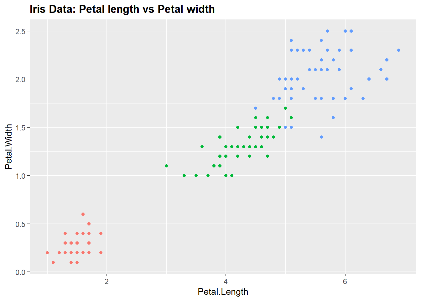
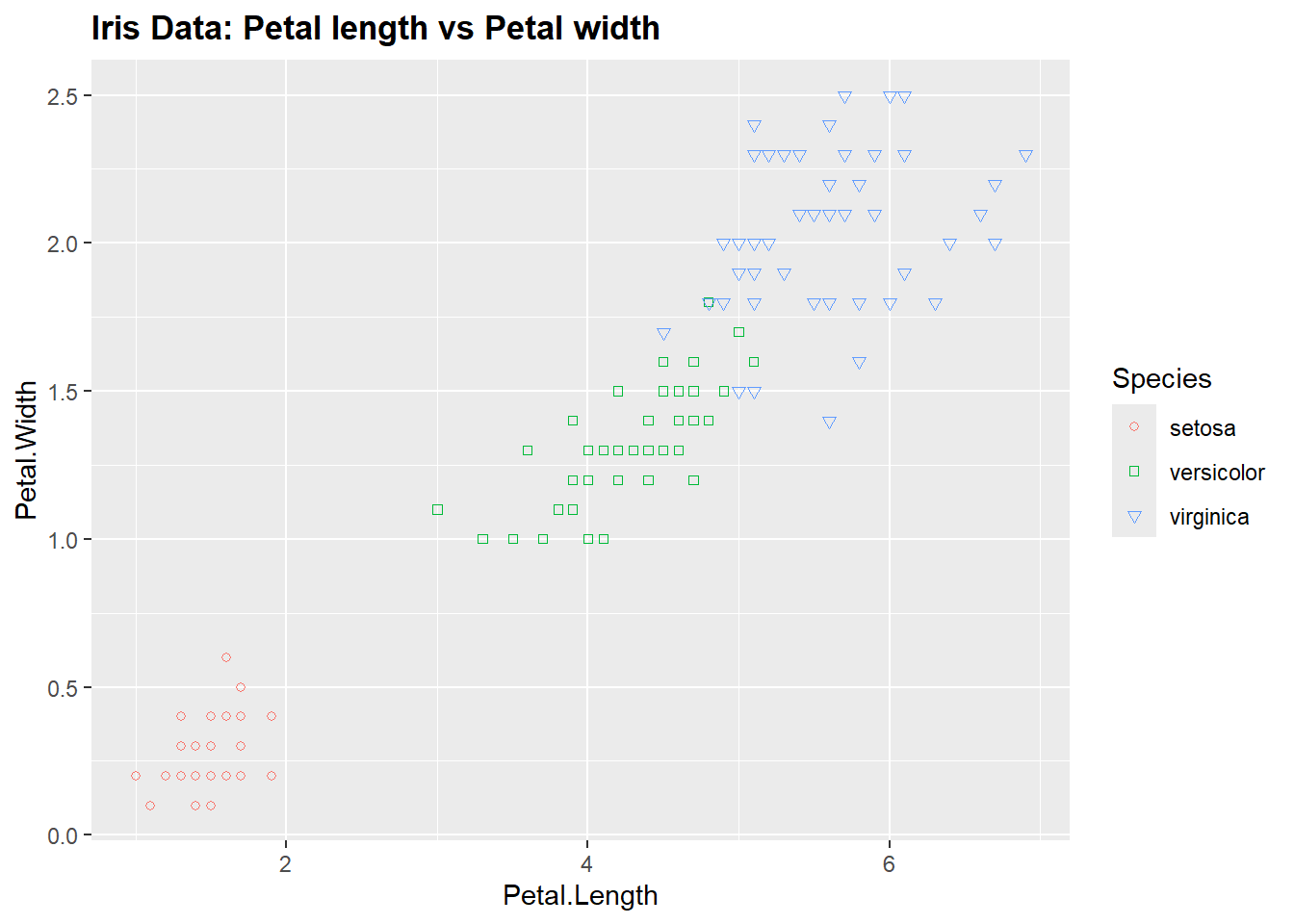
unclass() extracts the levels of a factor without any class attributes, as such in the iris$Species case, there are three levels, which will get converted into three integers, one to represent each level:
unclass(iris$Species) [1] 1 1 1 1 1 1 1 1 1 1 1 1 1 1 1 1 1 1 1 1 1 1 1 1 1 1 1 1 1 1 1 1 1 1 1 1 1
[38] 1 1 1 1 1 1 1 1 1 1 1 1 1 2 2 2 2 2 2 2 2 2 2 2 2 2 2 2 2 2 2 2 2 2 2 2 2
[75] 2 2 2 2 2 2 2 2 2 2 2 2 2 2 2 2 2 2 2 2 2 2 2 2 2 2 3 3 3 3 3 3 3 3 3 3 3
[112] 3 3 3 3 3 3 3 3 3 3 3 3 3 3 3 3 3 3 3 3 3 3 3 3 3 3 3 3 3 3 3 3 3 3 3 3 3
[149] 3 3
attr(,"levels")
[1] "setosa" "versicolor" "virginica" Now let’s break down the above code of c("red","green3","blue")[unclass(iris$Species)].
[unclass(iris$Species)] acts as an indexer based on the levels of the Species column. This means that for each species in the iris data set, it will pick a corresponding element from the vector it is being indexed on. For example, if the level is ‘1’, then it will take the first element of the vector it is indexed on.
# Example with integers (pch)
c(21,22,25)[unclass(iris$Species)]
[1] 21 21 21 21 21 21 21 21 21 21 21 21 21 21 21 21 21 21 21 21 21 21 21 21 21
[26] 21 21 21 21 21 21 21 21 21 21 21 21 21 21 21 21 21 21 21 21 21 21 21 21 21
[51] 22 22 22 22 22 22 22 22 22 22 22 22 22 22 22 22 22 22 22 22 22 22 22 22 22
[76] 22 22 22 22 22 22 22 22 22 22 22 22 22 22 22 22 22 22 22 22 22 22 22 22 22
[101] 25 25 25 25 25 25 25 25 25 25 25 25 25 25 25 25 25 25 25 25 25 25 25 25 25
[126] 25 25 25 25 25 25 25 25 25 25 25 25 25 25 25 25 25 25 25 25 25 25 25 25 25# Color example
c("red","green","blue")[unclass(iris$Species)] [1] "red" "red" "red" "red" "red" "red" "red" "red" "red"
[10] "red" "red" "red" "red" "red" "red" "red" "red" "red"
[19] "red" "red" "red" "red" "red" "red" "red" "red" "red"
[28] "red" "red" "red" "red" "red" "red" "red" "red" "red"
[37] "red" "red" "red" "red" "red" "red" "red" "red" "red"
[46] "red" "red" "red" "red" "red" "green" "green" "green" "green"
[55] "green" "green" "green" "green" "green" "green" "green" "green" "green"
[64] "green" "green" "green" "green" "green" "green" "green" "green" "green"
[73] "green" "green" "green" "green" "green" "green" "green" "green" "green"
[82] "green" "green" "green" "green" "green" "green" "green" "green" "green"
[91] "green" "green" "green" "green" "green" "green" "green" "green" "green"
[100] "green" "blue" "blue" "blue" "blue" "blue" "blue" "blue" "blue"
[109] "blue" "blue" "blue" "blue" "blue" "blue" "blue" "blue" "blue"
[118] "blue" "blue" "blue" "blue" "blue" "blue" "blue" "blue" "blue"
[127] "blue" "blue" "blue" "blue" "blue" "blue" "blue" "blue" "blue"
[136] "blue" "blue" "blue" "blue" "blue" "blue" "blue" "blue" "blue"
[145] "blue" "blue" "blue" "blue" "blue" "blue" We can change the font size of plots by adding additional parameters in the various plotting functions. These are well documented and called Graphical Parameters. Commonly used ones include:
cex.main: size of the main title.cex.lab: size of axis labels (text describing the axis)cex.axis: size of axis text (axis tick labels)If we want to display more than one plot per figure, we can use the par() function, which takes input (mfrow) in the form of a vector: mfrow = c(number of rows, number of columns).
par(mfrow = c(2,2)) # 2 x 2 = 4 plots in one figure
# 1st plot in (1,1),2nd plot in (1,2), 3rd plot in (2,1), 4th plot in (2,2)

boxplot(iris$Sepal.Length,
  col="lightblue",
  main="Sepal length")

boxplot(iris$Sepal.Length~iris$Species,
  col="lightblue",
  main="Sepal length by species")

boxplot(iris$Sepal.Length~iris$Species,
  col=heat.colors(3),
  main="Sepal length by species")

boxplot(iris$Sepal.Length~iris$Species,
  col=topo.colors(3),
  main="Sepal length by species")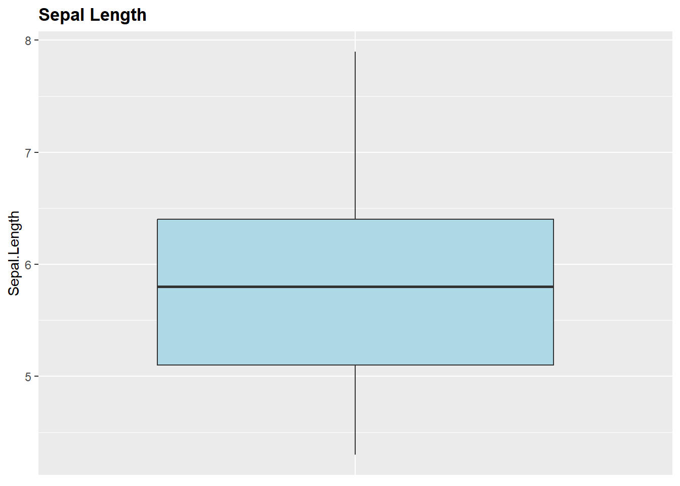
par(mfrow = c(2, 2))

hist(iris$Sepal.Length, breaks = 20, probability = T, xlim = c(4, 8), ylim = c(0.0, 1.0),
     col = "lightblue", xlab = "Sepal Length (cm)", main = "IRIS - Sepal length")
lines(density(iris$Sepal.Length), col = "blue", lwd = 2)

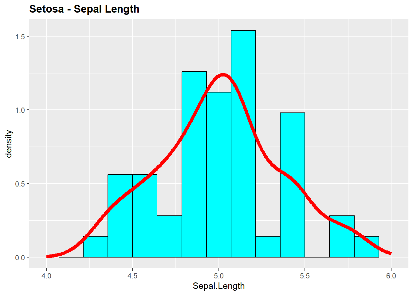
hist(iris[iris$Species == "setosa",]$Sepal.Length, breaks = 15, prob = T, xlim = c(4 , 6),
     col = "cyan", main = "setosa - Sepal length", xlab = "Sepal Length (cm)")
lines(density(iris[iris$Species == "setosa",]$Sepal.Length), col = "red", lwd = 3)

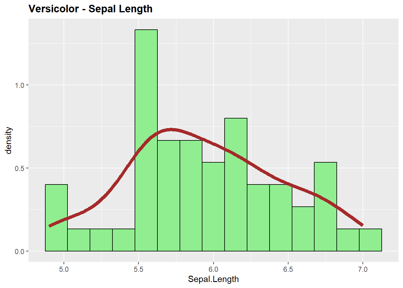
hist(iris[iris$Species == "versicolor",]$Sepal.Length, breaks = 15, prob = T,
     col = "lightgreen", main = "versicolor- Sepal length", xlab = "Sepal Length (cm)")
lines(density(iris[iris$Species == "versicolor",]$Sepal.Length), col = "brown", lwd = 3)

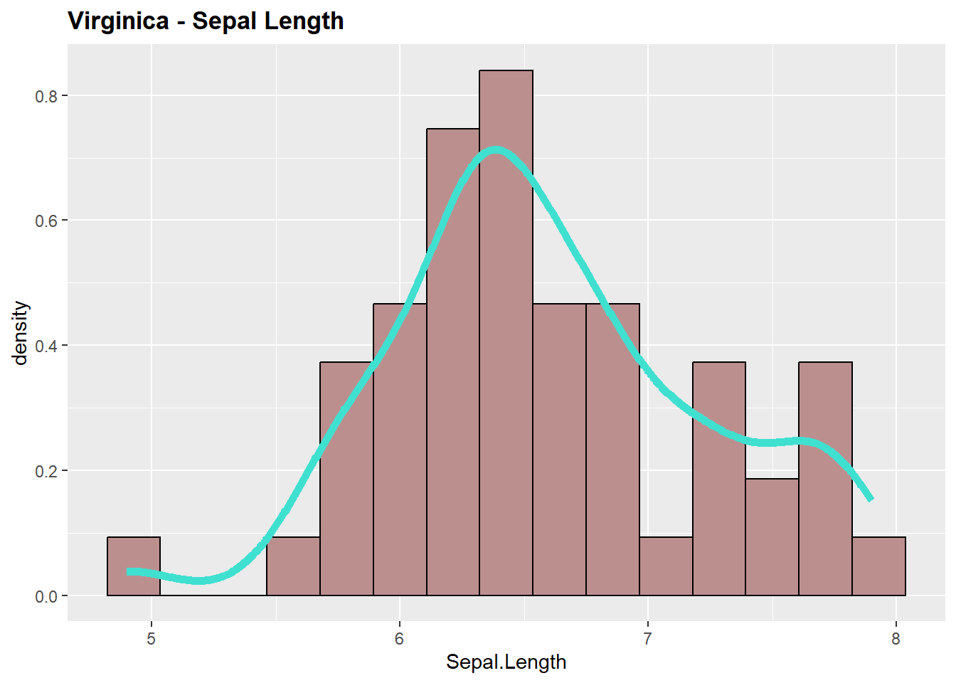
hist(iris[iris$Species == "versicolor",]$Sepal.Length, breaks=15,prob = T, col = "rosybrown",
     main = "virginica- Sepal length", xlab = "Sepal Length (cm)")
lines(density(iris[iris$Species == "virginica",]$Sepal.Length), col = "turquoise", lwd = 3)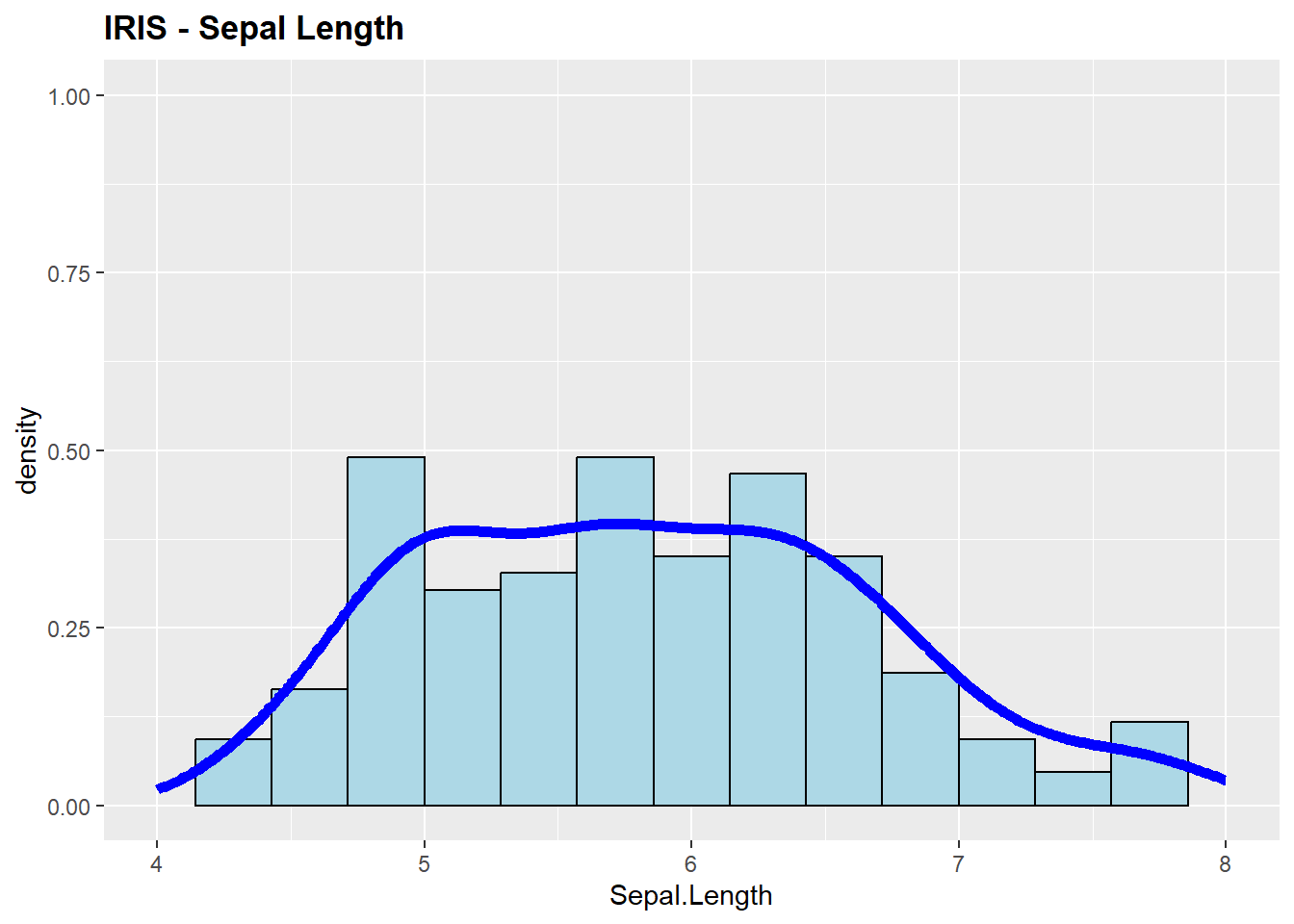
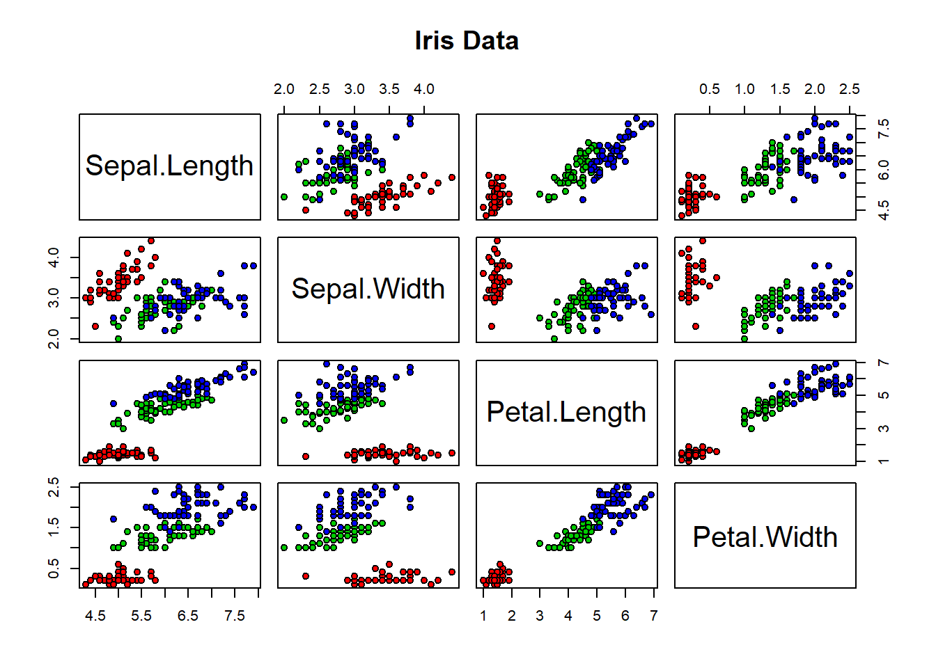
Pairwise plots allow us to visualize the distribution of single variables as well as relationships between two variables. These plots help us identify trends between variables on a wider scale. Simply put: pair plots are multipanel plots where every panel contains a plot between a different pair of variables.
To create a pairwise plot, we can use the pairs() function:
pairs(iris[1:4],
      main = "Iris Data", # Plot title
      pch = 21, # Point shape
      bg = c("red", "green3", "blue")[unclass(iris$Species)] # Species Color
     )
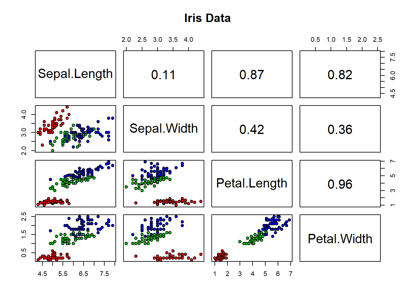
For further information, we can tell pairs() to include the correlation coefficient of each pair in either the upper or lower triangle of the plots. To do this, we will first need to create a user-defined function.
# Function to find correlation coefficient
panel.pearson <- function(x, y, ...) {
    horizontal <- (par("usr")[1] + par("usr")[2]) / 2;
    vertical <- (par("usr")[3] + par("usr")[4]) / 2;
    # (horizontal,vertical): position to enter the cor coefficient
    text(horizontal, vertical, format(abs(cor(x,y)), digits=2),cex=2)
    }
Afterwards, there’s a parameter in pairs() that allows us to assign a function to either the lower or upper panel:
# Make the upper triangle of pair plot be the correlation coefficients
# iris[1:4] get the data frame with only the first 4 columns which
# corresponds to variables: Sepal.Length, Sepal.Width, Petal.Length, Petal.Width
pairs(iris[1:4],
      main = "Iris Data",
      pch = 21,
      bg = c("red", "green3", "blue")[unclass(iris$Species)],
      upper.panel=panel.pearson,
     )
Alternatively, we could only include one triangle (either upper or lower), and also change the text on the diagonals (including font size and format).
pairs(iris[1:4],
      main = "Iris Data",
      pch = 21,
      bg = c("red", "green3", "blue")[unclass(iris$Species)],
      lower.panel=NULL, # Only include upper triangle
      labels=c("SL","SW","PL","PW"), # Rename diagonals
      font.labels=2, # Make the labels bold
      cex.labels=3.5) # Size up the labels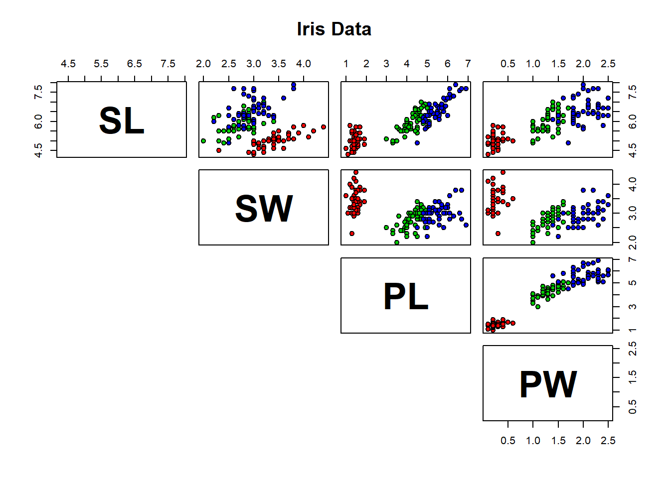
R is a function language that is generally very case-sensitive. A minor technique when working with data sets is to convert all variables to lowercase for ease of use. This is possible through the tolower() function.
# Make a copy of iris to convert into lowercase
iris_lower = iris
names(iris_lower) = tolower(names(iris_lower))

head(iris_lower,5) # check that variables names are in lower case in iris2
head(iris,5) # check that variables names are the same in iris| sepal.length | sepal.width | petal.length | petal.width | species |
|---|---|---|---|---|
| 5.1 | 3.5 | 1.4 | 0.2 | setosa |
| 4.9 | 3.0 | 1.4 | 0.2 | setosa |
| 4.7 | 3.2 | 1.3 | 0.2 | setosa |
| 4.6 | 3.1 | 1.5 | 0.2 | setosa |
| 5.0 | 3.6 | 1.4 | 0.2 | setosa |
| Sepal.Length | Sepal.Width | Petal.Length | Petal.Width | Species |
|---|---|---|---|---|
| 5.1 | 3.5 | 1.4 | 0.2 | setosa |
| 4.9 | 3.0 | 1.4 | 0.2 | setosa |
| 4.7 | 3.2 | 1.3 | 0.2 | setosa |
| 4.6 | 3.1 | 1.5 | 0.2 | setosa |
| 5.0 | 3.6 | 1.4 | 0.2 | setosa |
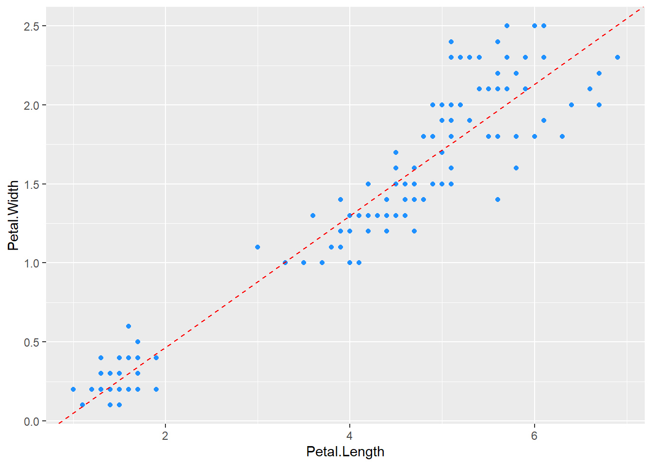
After plotting data in R, it is possible to fit a linear regression line on the data using lm() and overlay it onto the plot using abline().
lm() parameters we need:
y_values ~ x_valuesabline() parameters we need:
lm(), which is an object with a coef method.1.# running linear regression
# plot data and add fitted regression line
fit = lm(Petal.Width ~ Petal.Length, data=iris)
plot(Petal.Width ~ Petal.Length, data=iris, col="dodgerblue1")
abline(fit, col="red", lty=2,lwd=3)