lm.fit <- lm(medv ~ lstat, data = Boston)Simple Linear Regression
The simple linear regression model is a straightforward regression model that describes the relationship between one dependent and one independent variable using a straight line. This is the simplest form of linear regression.
We’ll be running our examples on the Boston Housing dataset, which is provided by the MASS package.
Generating a Linear Regression Fit
To perform simple linear regression on R, we will start by calling the lm() function to fit medv as the response, and lstat as the predictor.
The basic syntax is
lm(y ~ x, data), whereyis the response variable, andxis the explanatory variable.datais the argument that specifies the dataset where the variables originate from.
If we run lm.fit, R will output some basic information about the fitted linear model such as the intercept and slope.
For more detailed information, summary(lm.fit) will provide us the p-values and standard errors for the coefficients, as well as the R^2 and f-statistic.
summary(lm.fit)
Call:
lm(formula = medv ~ lstat, data = Boston)

Residuals:
    Min      1Q  Median      3Q     Max
-15.168  -3.990  -1.318   2.034  24.500

Coefficients:
            Estimate Std. Error t value Pr(>|t|)
(Intercept) 34.55384    0.56263   61.41   <2e-16 ***
lstat       -0.95005    0.03873  -24.53   <2e-16 ***
---
Signif. codes:  0 '***' 0.001 '**' 0.01 '*' 0.05 '.' 0.1 ' ' 1

Residual standard error: 6.216 on 504 degrees of freedom
Multiple R-squared:  0.5441,    Adjusted R-squared:  0.5432
F-statistic: 601.6 on 1 and 504 DF,  p-value: < 2.2e-16
Attributes of a Fitted Linear Regression Model
To locate what other pieces of information are stored in lm.fit, we can call on the names() function.
Similar to a dataframe, we extract this information by name— e.g.
lm.fit$coefficients— although it is safer to use the extractor functions such ascoef()to access them.
names(lm.fit) [1] "coefficients" "residuals" "effects" "rank"
[5] "fitted.values" "assign" "qr" "df.residual"
[9] "xlevels" "call" "terms" "model" coef(lm.fit)(Intercept) lstat
34.5538409 -0.9500494 Confidence intervals for coefficient estimates
In order to obtain a 95% confidence interval for the coefficient estimates (intercept and slope), we can use the confint() function. Typing confint(lm.fit) will allow us to obtain the confidence intervals of the intercept and lstat slope.
confint(lm.fit) 2.5 % 97.5 %
(Intercept) 33.448457 35.6592247
lstat -1.026148 -0.8739505Prediction intervals for a given x-value
The predict() function can produce both a prediction interval for the y-value and a confidence interval for the mean response at any x-value, depending on the interval argument specified.
If interval = "confidence", it provides a confidence interval for the mean response. If interval = "prediction", it provides a prediction interval for the y-value.
tbl = predict(lm.fit, data.frame(lstat = (c(5,10,15))),
interval = "prediction")| lstat | fit | lwr | upr |
|---|---|---|---|
| 5 | 29.80359 | 17.565675 | 42.04151 |
| 10 | 25.05335 | 12.827626 | 37.27907 |
| 15 | 20.30310 | 8.077742 | 32.52846 |
predict(lm.fit, data.frame(lstat = (c(5,10,15))),
interval = "confidence")| lstat | fit | lwr | upr |
|---|---|---|---|
| 5 | 29.80359 | 29.00741 | 30.59978 |
| 10 | 25.05335 | 24.47413 | 25.63256 |
| 15 | 20.30310 | 19.73159 | 20.87461 |
For instance, the 95% confidence interval for medv associated with a lstat value of 10 is (24.47,25.63), and the 95% prediction interval is (12.828,37.28). As expected, the confidence and prediction intervals are centered around the same point (a predicted value of 25.05 for medv when lstat equals 10), but the latter is substantially wider.
Plotting a Least-Squares Regression Line
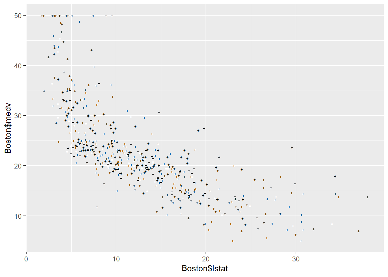
We can overlay a least-squares regression line over a plot using the abline() function. Demonstrated below, is the scatterplot of medv over lstat, with the regression line shown.
plot(Boston$lstat, Boston$medv)
abline(lm.fit)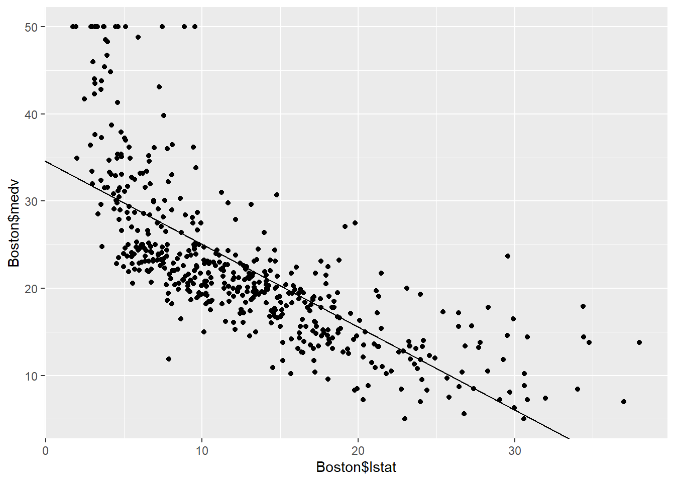
There is some evidence for non-linearity in the relationship between lstat and medv. This issue is can be further explored and diagnosed using residual plots as shown later in Diagnostic plots.
Drawing lines with abline()
Aside from the least-squares regression line, the abline() function can draw any line on a plot with intercept a and slope b. To do so, we would type abline(a,b).
Below we experiment with some additional settings for plotting lines and points:
The
lwd = 3command increases the width of the regression line by a factor of 3. This works for the plot() and lines() functions also.We can also use the
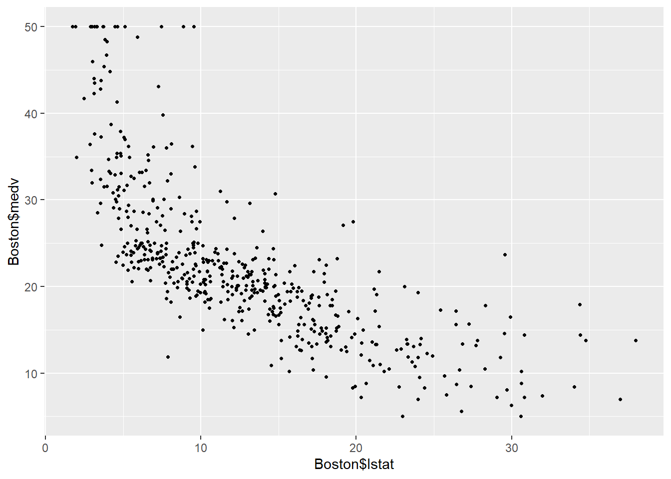
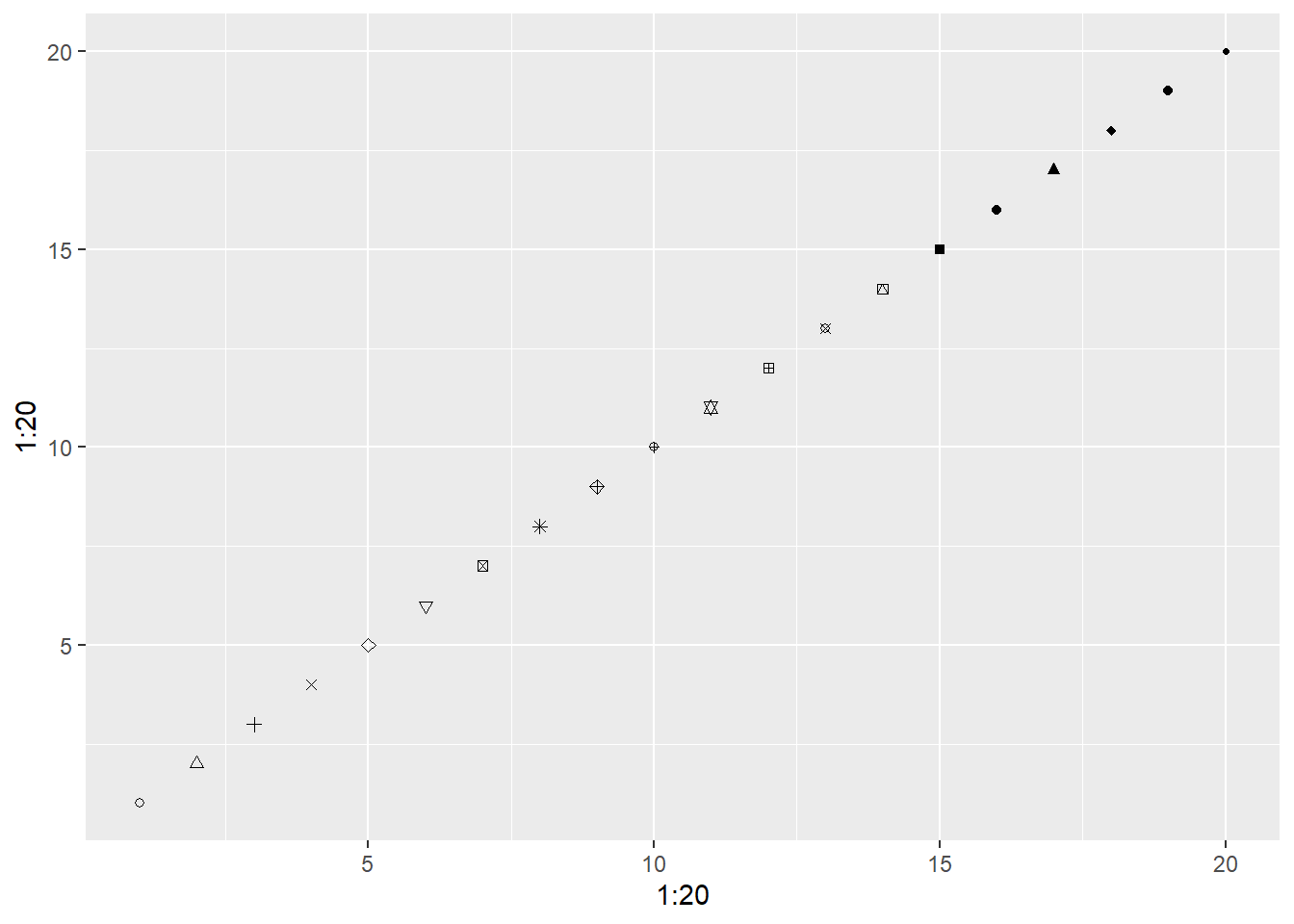
pchoption to create different plotting symbols.
plot(Boston$lstat, Boston$medv)
abline(lm.fit, lwd = 3, col = "red")         # abline() with col='red'
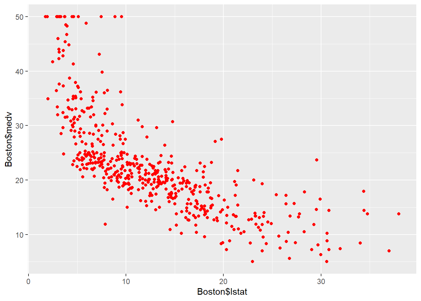
plot(Boston$lstat, Boston$medv, col = "red") # plot() with col='red'
plot(Boston$lstat, Boston$medv, pch = 20)    # plot() with pch=20
plot(Boston$lstat, Boston$medv,  pch = "+")  # plot() with pch='+'
plot(1:20, 1:20, pch = 1:20)                 # plot() with all the pch options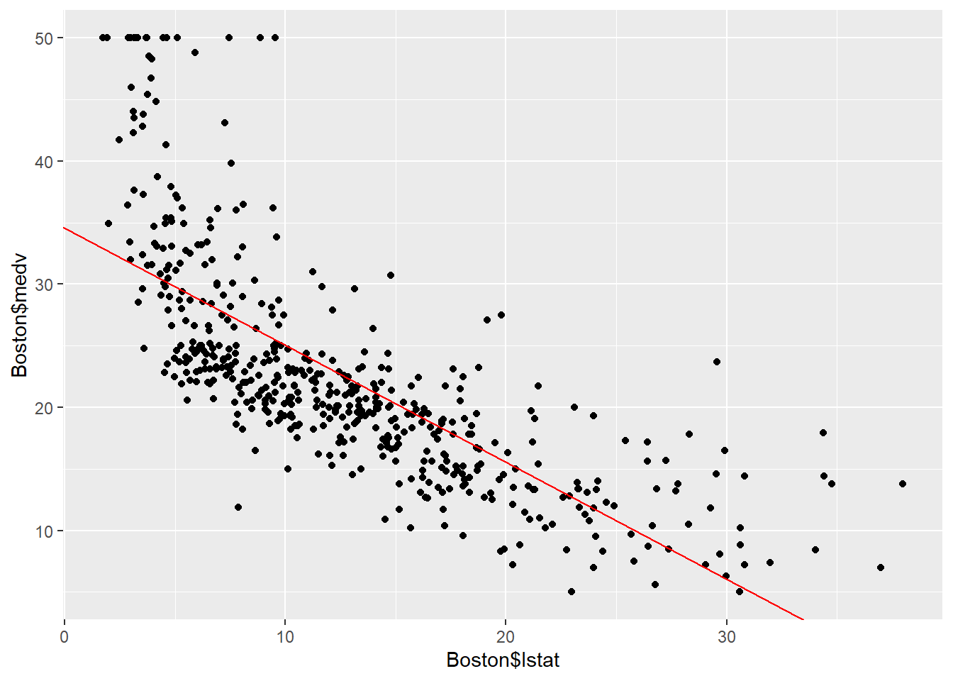
Diagnostic Plots
Diagnostic plots are visual indicators that help us evaluate the validity of assumptions made by a linear regression model. These include:
- Linearity: assumes there is a linear relationship between the independent and dependent variable. We can check for linearity in the Residuals vs. Fitted Values plot, where we want the residuals to be randomly scattered around the horizontal-axis (zero-line) without a clear pattern.
- Normality of Residuals: assumes the residuals follow a normal distribution. The Normal Q-Q plot checks this assumption; the points on the Q-Q plot should fall approximately along a straight line to indicate that the residuals are normally distributed.
- Scale-Location: assumes the spread of residuals remains constant across all values of the independent variable. We want to look for a consistent spread in the Scale-Location plot, not an increasing/decreasing spread.
- Residuals vs. Leverage: this plot helps us identify outliers or leverage points that may impact the model’s results.
Creating diagnostic plots
Four diagnostic plots are automatically produced by applying the plot() function directly to the output from lm(). In general, this command will produce one plot at a time, and hitting Enter will generate the next plot. However, it is often convenient to view all four plots together. We can achieve this by using the par() and mfrow() functions, which tell R to split the display screen into separate panels so that multiple plots can be viewed simultaneously.
For example,
par(mfrow = c(2,2))divides the plotting region into a 2 by 2 grid of panels.
par(mfrow = c(2,2))
plot(lm.fit, lwd = 3)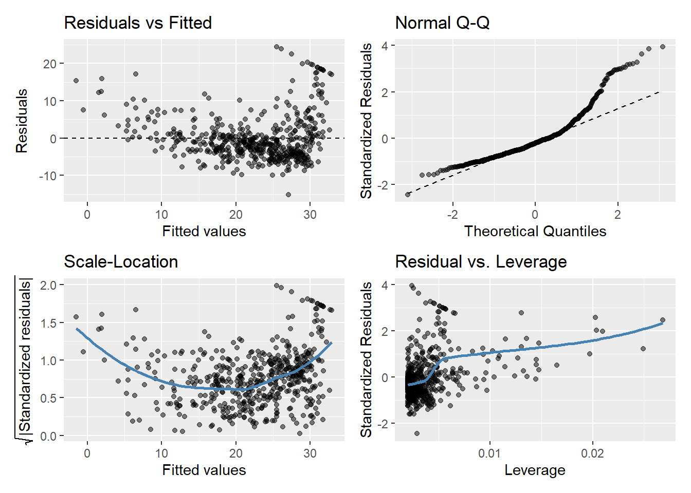
Using residuals()
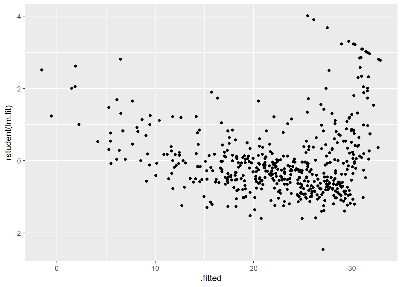
Alternatively, the residuals() function allows us to compute the residuals from a linear regression fit. The function rstudent() will return the studentized residuals, which we can use to plot the residuals against the fitted values.
Studentized residuals are similar to regular residuals, however, they are plotted by their standard deviation value instead.
plot(predict(lm.fit), residuals(lm.fit)) # Residual plot
plot(predict(lm.fit), rstudent(lm.fit))  # Studentized residual plot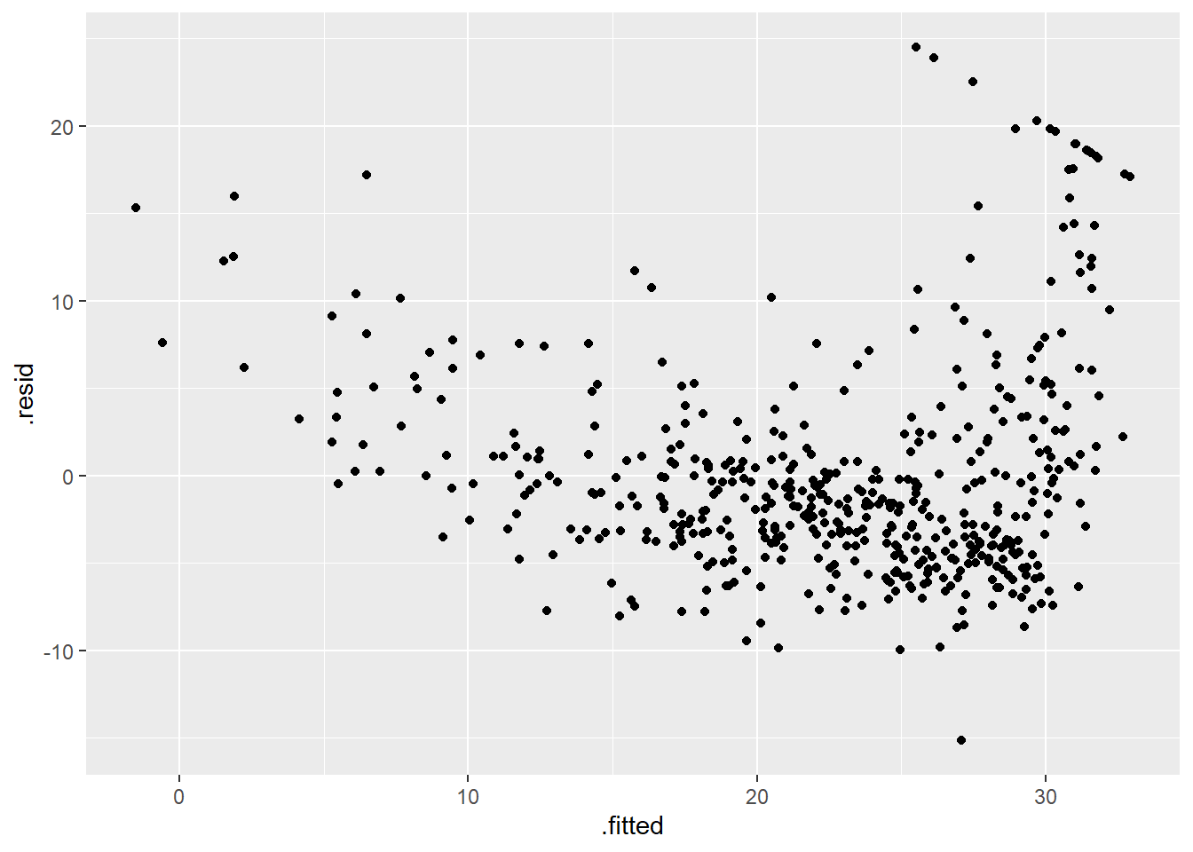
Leverage statistics
From looking at the above residual plots, we see some evidence of non-linearity (the Residuals vs Fitted Values plot shows signs of a pattern instead of randomness).
To investigate this case further, the hatvalues() function will allow us to check the leverage of each point, showing us how far each observed value is from the predicted value.
plot(hatvalues(lm.fit))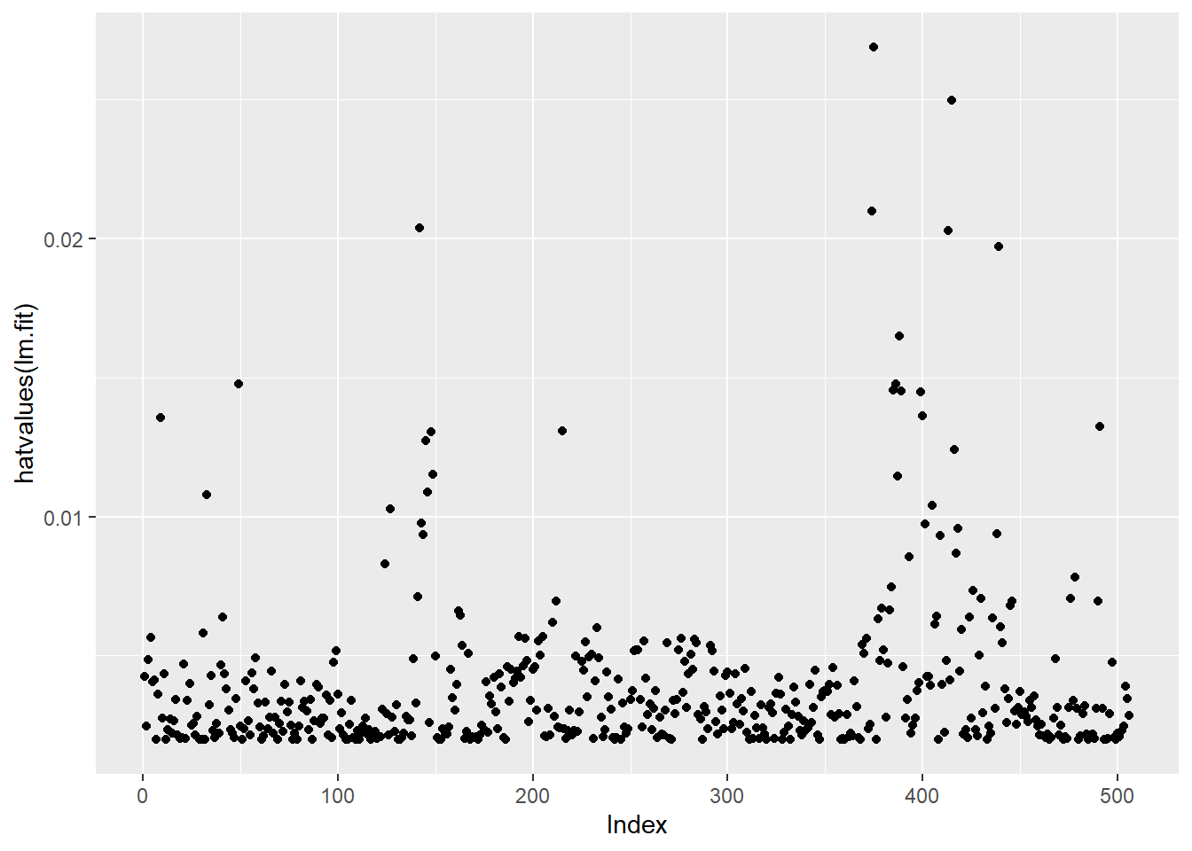
The which.max() function identifies the index of the largest element of a vector. When paired with hatvalues(), it returns the observation with the largest leverage statistic.
which.max(hatvalues(lm.fit))375
375