In this lab, we’ll learn how to apply the K-means algorithm, which is one of the most popular clustering algorithms in machine learning, to the IRIS dataset.
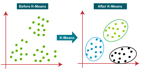
A K-means model stores k centroids that it uses to define clusters. A point is considered to be in a particular cluster if it’s closer to that cluster’s centroid than any other centroid. Typically in K-means, the distance between a point and its clusters is calculated using the euclidean distance formula.
Clustering in K-Means (Javatpoint.)
K-Means Simulation
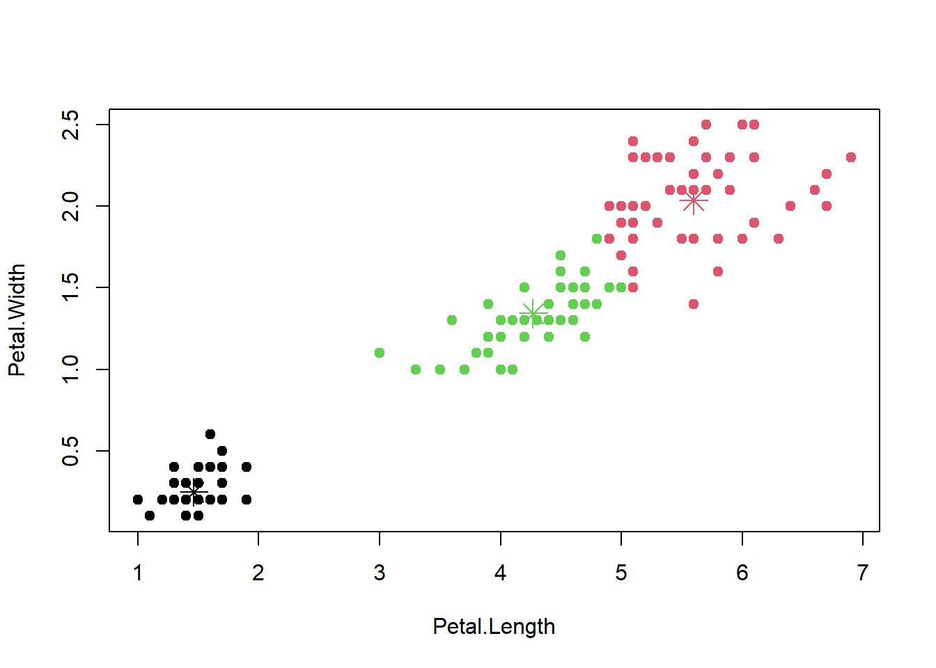
Below is an IRIS dataset simulation of the K-means algorithm, which takes in inputs for the X, Y, and K (cluster count) values. The black X’s mark the center of each cluster, and the different clusters are grouped by color.
The Iris Dataset with K-means
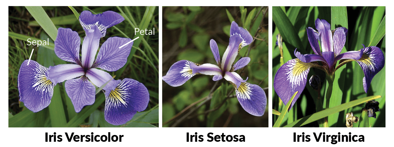
Once again, we’ll be working with the Iris dataset in this lab. It is a well-known dataset introduced by Ronald Fisher in his 1936 paper. This dataset contains three plant species (setosa, virginica, versicolor) and four features measured (Sepal.Length, Sepal.Width, Petal.Length, Petal.Width) for each sample, all measurements of each feature are given in centimeters.
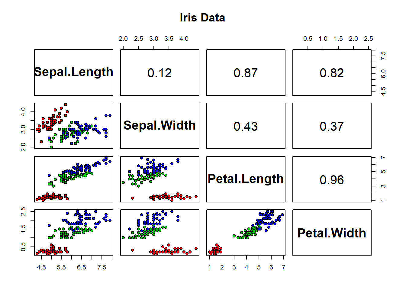
Below, are the pairwise correlation coefficients of the Iris dataset:
# function to find correlation coefficientpanel.pearson <-function(x, y, ...) { horizontal <- (par("usr")[1] +par("usr")[2]) /2; vertical <- (par("usr")[3] +par("usr")[4]) /2;# (horizontal,vertical): position to enter the cor coefficienttext(horizontal, vertical, format(abs(cor(x,y)), digits=2),cex=2) }# make the upper triangle of pair plot be the correlation coefficientspairs(iris[1:4], main ="Iris Data", pch =21, bg =c("red", "green3", "blue")[unclass(iris$Species)],upper.panel=panel.pearson,font.labels=2, # bold the labelscex.labels=2# size up the labels )
K-means Clustering with all Variables
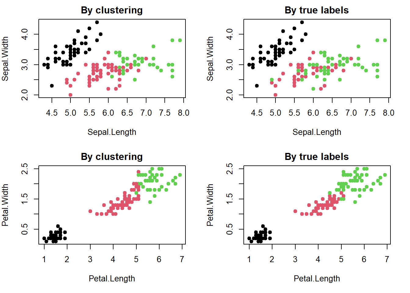
K-means Clustering works with unlabeled data, but in this case, we have a labeled dataset so we have to use the Iris data without the Species column. This way, the algorithm will cluster the data and we will be able to compare the predicted results with the original results.
# Prepare the data without the class (species) information iris.unclass = iris[,c(1,2,3,4)]iris.class = iris[,"Species"]head(iris.unclass)
The K-means object we’ve created has many properties. For example, we could index it by the center values, and find the center means for all the different classes:
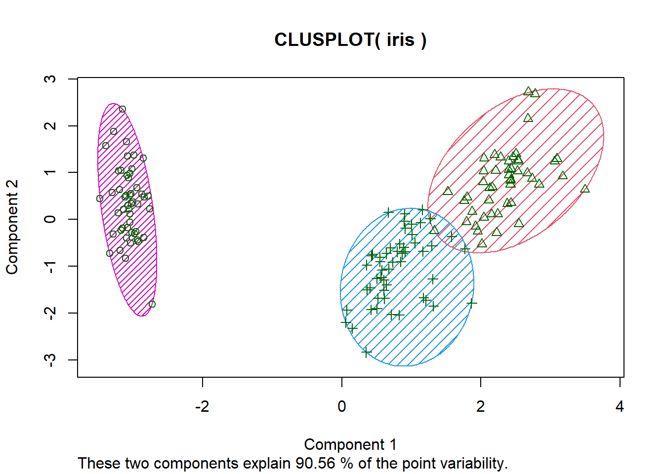
An alternative way to plot K-means is through using the clusplot() function provided by the cluster package. The main advantage this function provides over the previous method is that it allows us to clearly see the shape of each cluster.
What if we don’t know how many clusters there are? We won’t always have the labeled data. If we wanted to know the exact number of clusters, there’s different types of criteria we could use to estimate it.
The elbow method
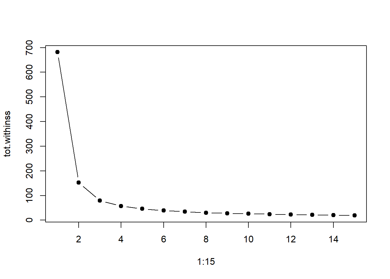
The basic idea of the elbow method is to look for the ‘elbow point’ in a K-means sum of squared distances plot where adding more clusters stops significantly reducing that overall sum. This ‘elbow’ point suggests the o ptimal number of clusters k.
# tot.withinss = "total within-cluster sum of squares"tot.withinss <-vector(mode="character", length=15)for (i in1:15){ kmresult <-kmeans(iris.unclass[,1:4], center=i, nstart=20) tot.withinss[i] <- kmresult$tot.withinss}# Visualizing itplot(1:15, tot.withinss, type="b", pch=19)
As we saw, the ‘elbow’ point where the total sum of squares value stops drastically decreasing is when k = 3.
The intuition is that increasing the number of clusters will naturally improve the fit (explain more of the variation), since there are more parameters (more clusters) to use, but that at some point this is over-fitting, and the elbow reflects this.
Silhouette plot
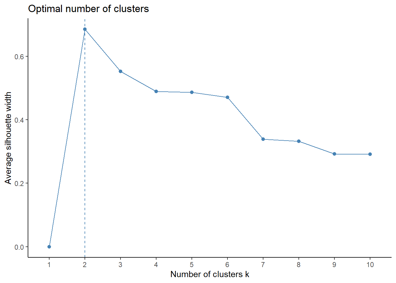
A silhouette plot simplifies the evaluation of k-means clustering by showing how well each data point fits into its cluster, helping to gauge the quality of clustering and make informed decisions about cluster structure and number.
Here, the silhouette coefficient estimates the average distance between clusters. To do this, we’ll need the factoextra package in R, which comes with the fviz_nbclust() function.
The above plot shows the silhouette coefficient over values of k ranging from one to ten. The results show that when k = 2, the silhouette width is at its highest, with the k = 3 variant not too far behind.
Majority vote
For this method of determining the optimal k value, we’ll use the NbClust package and function, which provides us with a comprehensive way to determine the best k value using consensus clustering.
It’ll evaluate multiple methods such as silhouette width, Dunn index, and many other outputs to assess clustering quality of each k value.
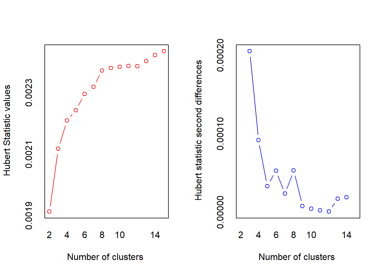
*** : The Hubert index is a graphical method of determining the number of clusters.
                In the plot of Hubert index, we seek a significant knee that corresponds to a
                significant increase of the value of the measure i.e the significant peak in Hubert
                index second differences plot.
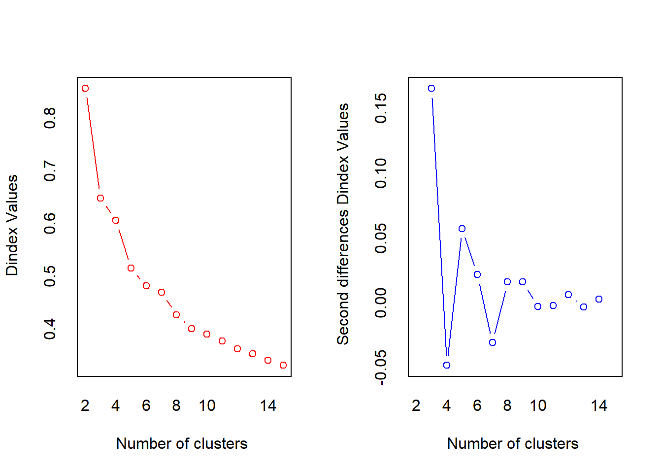
*** : The D index is a graphical method of determining the number of clusters.
                In the plot of D index, we seek a significant knee (the significant peak in Dindex
                second differences plot) that corresponds to a significant increase of the value of
                the measure.

*******************************************************************
* Among all indices:
* 11 proposed 2 as the best number of clusters
* 11 proposed 3 as the best number of clusters
* 1 proposed 8 as the best number of clusters
* 1 proposed 12 as the best number of clusters

                   ***** Conclusion *****

* According to the majority rule, the best number of clusters is  2


*******************************************************************
Cluster validation
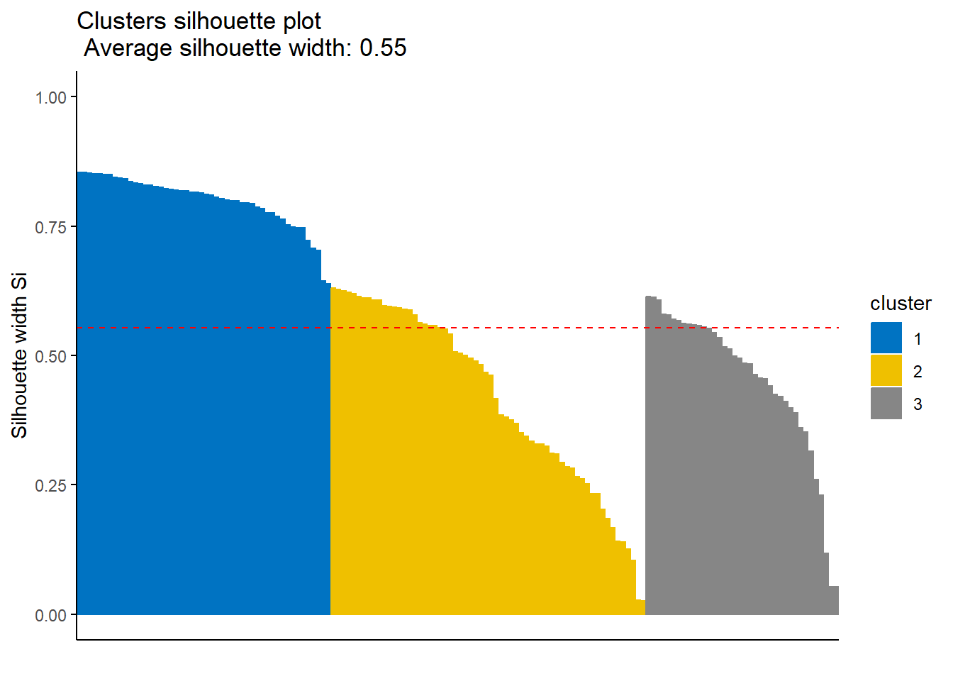
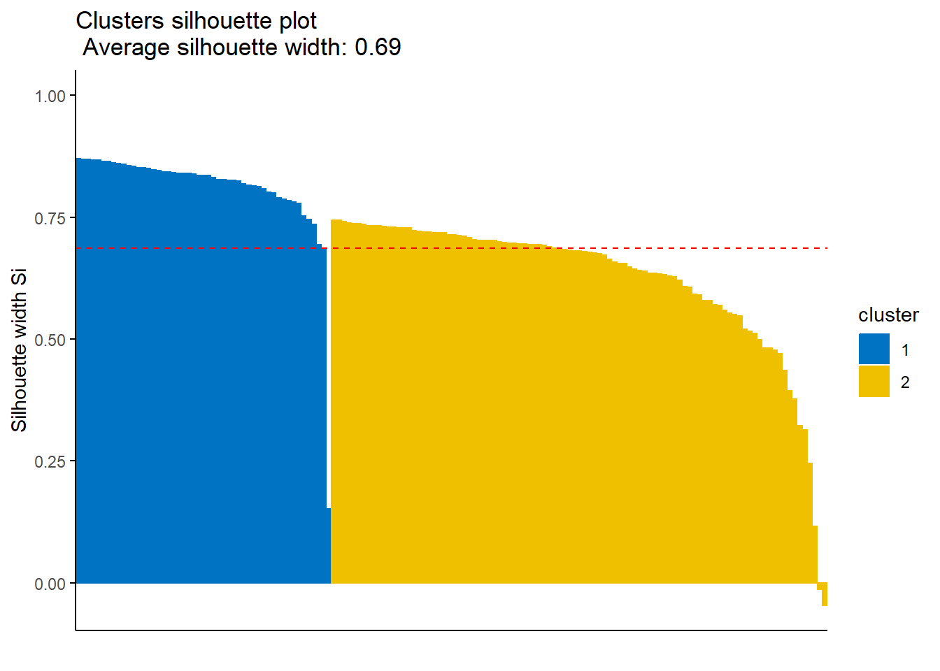
The last part of our analysis is to validate the clusters we’ve found. To do so, we can utilize the silhouette coefficient of the clusters, as it measures how similar an object i is to the other objects in its own cluster versus those in its neighbour cluster.
Values close to one indicate that the object is well-clustered.
To do this, we’ll use the pam() function, which stands for “Partitioning Around Medoids” algorithm, as it’s a more robust form of the K-means model. We’ll specify that there are 3 clusters, as well as the distance method, which is euclidean.
As a visualizer, we’ll once again use the factoextra package’s functions. fviz.silhouette() assists in graphing out the silhouette width of each cluster.
According to the silhouette coefficients, the model with only two clusters outperforms the model with three clusters, even though we know the true number of classes (3), since the two-cluster model has a higher silhouette coefficient (0.69 versus 0.55).
Clustering in K-Means (Javatpoint.)Figure 1: Iris Flowers (Willems, 2018)